logo
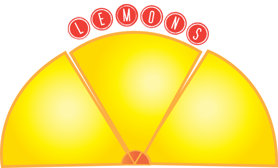
This is my 3- shape logo. The shapes I used were triangles and circles. That is because they are my favourite shapes. I chose to make my logo for lemons bought in store. I used a gradient on each slice of lemon, to add a subtle effect to it. The orange stroke outlines the lemon well and looks nice. Lastly, the font I chose reminded me of a lemonade stand that was set up in the summer. I think it complimented and colour-contrasted with the lemon well.
my cartoon
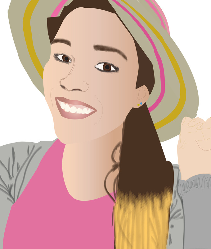
Hi! This is me in cartoon form. It took a lot of patience and time but when I finished I was very happy with the result. The hardest part was my hand, hat and eyes. It was very time consuming and so was getting the right colour to match my skin tone. In the end, I think it looks like me. I hope you enjoy my cartoon :)
If people aren’t laughing at your goals, your goals are too small.
— Kai Greene
